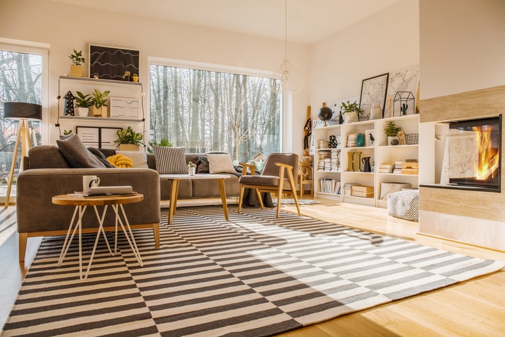
-
Color Guide: The 60-30-10 Rule
Picking and combining colors is sometimes the most challenging part of the design process. The 60-30-10 rule is one color guide of many helpful options for finding the right color balance.
What is the 60-30-10 Rule?
60%
As the largest number, it represents the primary color (no pun intended) that you’ll frequently use. You can think of this option as your base –the backdrop– that every other color will work off. Usually, people pick neutral colors since they are easier to mix and match with different colors, but you can dare to be bold with dark blues, greys, and even black.
30%
Your second color should add contrast to your base. Coordinating colors are the easiest choice, but don’t be afraid to play around with your options. If you have a wall bed, this could be the color to put on the outer cabinets.
10%
The smallest number is your accent color. This color can be bright and bold or darker than the rest– it depends on your base. If your first two colors are pastel, your accent color can be more saturated. Picture this color in your bed cover, a rug, vases, or other decorations scattered through your space. The most important thing to remember is don’t overdo it.

100% Harmonious
Now imagine a teen’s room color using this guide. Imagine a room with light gray walls (60), light, dusty pink wall units and bed frame (30), and beautiful denim blue pillows and blue, delicate decoration pieces (10). These three colors work harmoniously to create a peaceful color palette.
Be a Rule Breaker
The word “rule” suggests that you must follow it to a T, but the 60-30-10 rule is more of a structured suggestion. You can incorporate more than three colors in your space without being visually overwhelming. Work in a fourth color through small decorations or a small furniture piece.
The beauty of a custom design is that you can tailor your space to your personal taste. Get help from the best. More Space Place Dallas designs with attention to detail to achieve visually pleasing spaces with the most functionality. Book a design consultation today.
If you enjoyed this article please consider sharing it!


